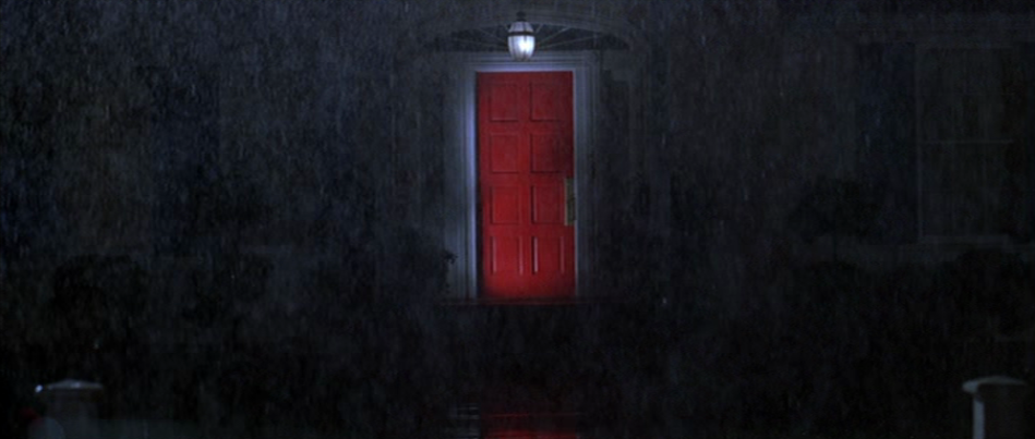
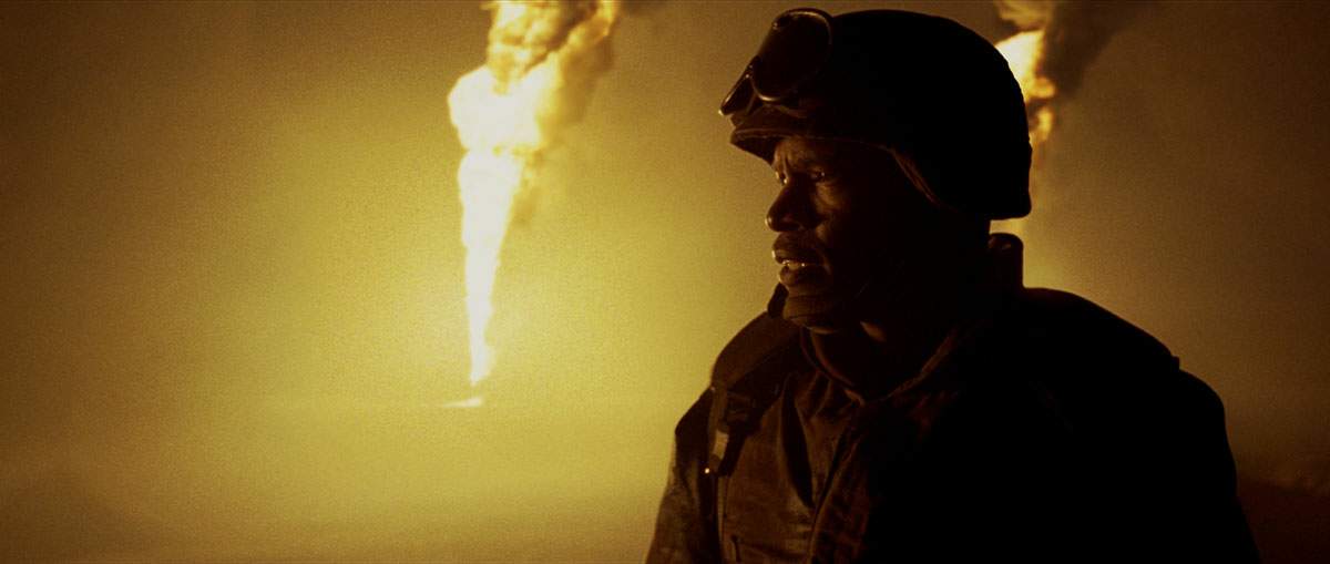
Sam Mendes is interested in colour and light; the red door of American Beauty, the flaming oil wells of Jarhead.
Skyfall is no different. The film opens with an out of focus Bond and an important early shot, viewed through a mirror, shows him disappearing into shadows (a recurring motif).

The interplay of colour and darkness is apparent throughout the Shanghai scenes. We see Bond in a glowing blue pool amongst Shanghai’s rooftops, and this colour dominates the next scene.


Blue represents technology (and its dangers).


The gold seen in the last image carries to the next Shanghai scene, set in – appropriately – a casino.


Silva’s abandoned ruins are stripped, bone-white, bare.

When we return to England, the colours are muted: whites, earthy browns and gun-metal grays.


The first shots of Scotland are pastoral; chestnut browns and gently encroaching white fog.

…but as violence envelops the countryside, the palette shifts to the gun-metal gray of England, then the darkness of night.
Orange is introduced as salvation, the flash of a torch revealing escape. But it is revealed to be a threat, and orange becomes the dominant colour.


Upon returning to England the buildings are white, representing cleansing or – perhaps – Silva’s ruins.


Pingback: Skyfall (2012) « Carbon Copy
Great post, I loved the use of colour in Skyfall.
Thanks! I didn’t think story-wise and action-wise it quite matched up to Casino Royale, but the cinematography was truly exceptional.
Pingback: John Wick (2014) | ccpopculture
I don’t think the meaning behind blue is to do with the dangers of technology at all. Blue is frequently used in the first half of the film, in the lighting and clothes of the MI6 personnel including Bond. Blue, as in having “the blues”, refers to melancholy. It’s a rare emotion in a Bond film, but in keeping with literary Bond, which this film channels, especially novels like The Man With the Golden Gun.
The relevance of Bond an MI6 are frequently called into question. Craig is 44 here, which in the novels is referenced as the final year for a Double-0 in the field. More importantly, Q references the relevance, age, and melancholy in his itnroduction in the art museum when he says about the painting: “Always makes me feel a little melancholy. A grand old warship being ignominiously hauled away for scrap. The inevitability of time, don’t you think? What do you see?”
Bond replies: “A bloody big ship”, a line that begins Bond’s turning point and journey back to peak fitness and ability. So much of this film is about destroying the past, to make way for new leadership at MI6 and Bond unencumbered by his childhood/past. Rebirth or “resurrection” as Bond tells Silva.